1. Introduction
If there's one thing similar about an interesting dataset and a good rerun football's match on TV, is that they're both doing pretty excellent job at keeping everyone's safe at home during this time of the pandemic. And in all honesty, I'm not a data-scientist, nor a dev guru. I just recently got myself exposed to Machine Learning, Data Mining and Artificial Intelligent in general, while doing them in both Dataiku and Python (Pandas, NumPy and SciKit libraries), somewhere a little over then 3 months period of time. And without any further ado, here's my take to the FIFA conundrum's challenge.
2. Dataflow
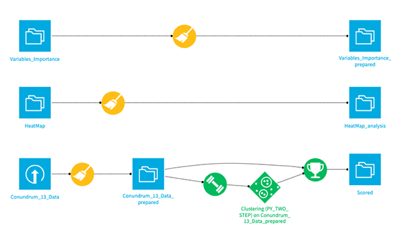
And since the challenge is not to 'predict' any variables, rather to 'group' or 'cluster' the existing dataset from the player's skillsets, in reflect to their wages rate. Here's what my current flow would look like, and don't bother much on the 2 additional datasets, as they're merely exported from the existing model, so that I may explore them further later on. And to follow along, here's the link to download the dataset in my Github repository.
3. Prepare Recipes
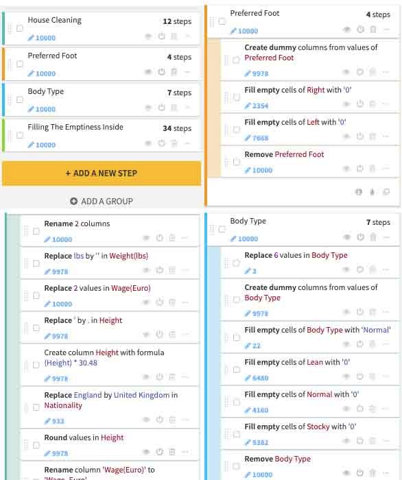
And here's how I go about on the prepare recipes, nothing out of the ordinary. Just converting categorical to numerical values, through the one-hot encoding and filling up the 'NaN' with median values, while grouping them to have better clarity, if ever the need occur for me to go back and revise anything again for future reference.
4. Data Modeling & Training
While on the modeling and training steps, I choose the 'Interactive Clustering' machine-learning algorithm, which in returned, delivered me a sufficient scoring value. As a side note, Dataiku provide you with various Machine Learning Algorithm according to your prediction methods requirement. Be it for Supervised Learning (develop predictive model based on both input and output data) and Unsupervised Learning (group and interpret data based only on input data). And for the article alone, will be utilizing the later version of Unsupervised Learning for data mining/clustering.

5. Data Clustering
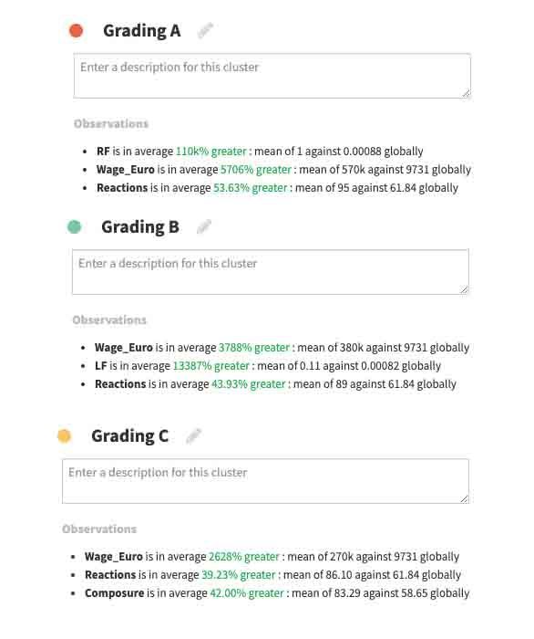
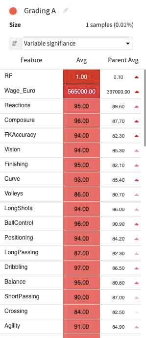
On to the clustering variables name, I simply identified them in the grading manner, starting from 'Grading A', as the most top-knot performer, all the way down to the least performing one marked with 'Grading E'.
6. Cluster Plot
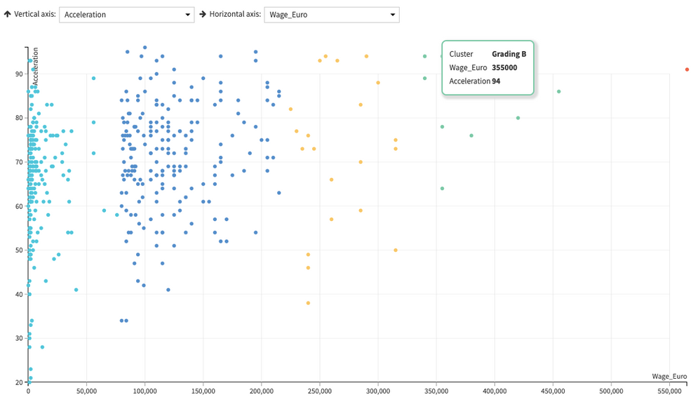
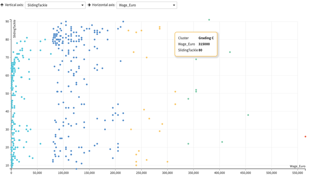
And here's how my cluster plot would look like, obviously the better the grade, the least volume of players getting included in them.
Acceleration x Wage
Sliding Tackle x Wage
7. Grading Variables
And for sure, those who sit at the Grading A level would stand above the average threshold measurements (though, that's not always the case with other included variables, which I'm about to show down below).
8. Values Proposition
And coming back again to the initial question, "Creating a flow that outputs a value proposition in term of the wages". I think I didn't include the players name and their nationalities in my modeling for a couple of reasons. In my opinions, those two variables are just way too subjective to get included. In a sense, you could be a top-knot player, regardless of what your 'Names' would sound like, and of course your 'Nationalities'.
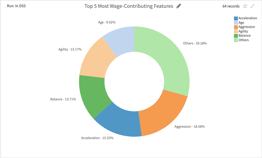
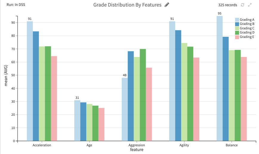
So I've done the DSS flow diagram, while the followings are my list of 'value proposition' that contributed of being one 'Grading-A' player in the field.
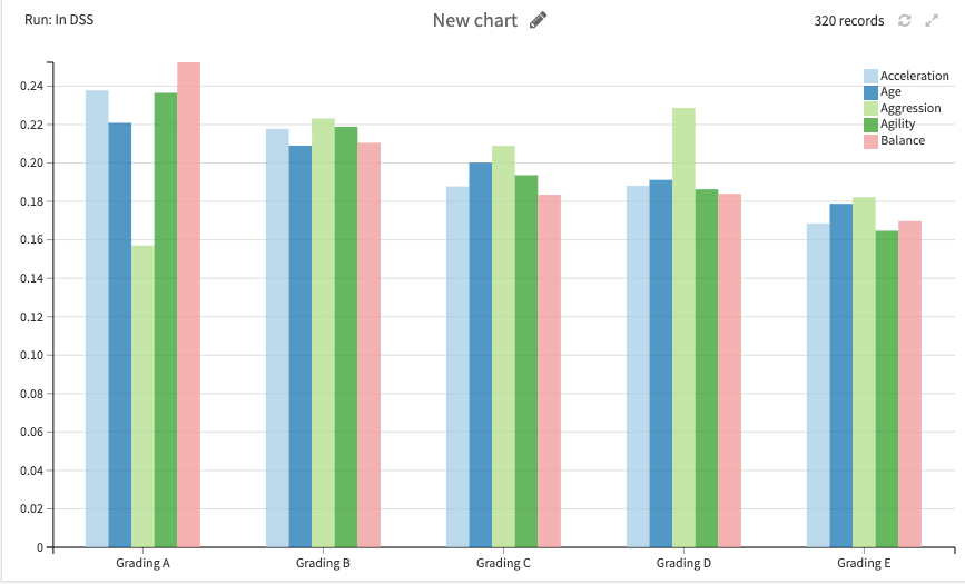
9. Top 5 Values Proposition
10. Top 5 Values Proposition By Distribution
11. Correlation Matrix
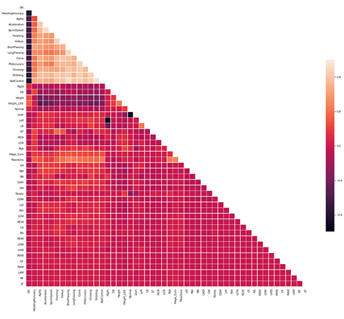
The very first correlation analysis consists of plotting the Correlation matrix for numerical variables. For each couple of numerical variables, this computes the "strength" of the correlation (called the Pearson coefficient):
- 1.0 means a perfect correlation
- 0.0 means no correlation
- -1.0 means a perfect "inverse" correlation
Since it does not really make sense to print this correlation plot for hundred of variables, we are restricting it to the first 50 numerical variables of the dataset.
11. Jupyter Notebook
Notes: Here are the links to the Python - Jupyter Notebook edition for the analysis process coming from Dataiku.
- Correlation's analysis.
- Correlations analysis scored.ipynb).
- High dimensional (t-SNE).
- PCA.
- Statistics and tests on a single population.
- Statistics and tests on multiple populations"
If you wish to load the whole Project files into your working Dataiku's project directory, download the whole files required at my GitHub repo as a single Zip file, and load them through the main interface.
Been enjoying exploring this dataset for sure, and certainly it was fun doing it, stays safe everyone and leave a thumbs-up if you like the article and found this useful. 😊